 A Tag Analysis: Romance in K-Dramas - Conclusion

Welcome to part four of the Popular Visual Cues in K-Dramas series. For those who missed the previous parts, you can check out this handy index below:
INDEX | |
|---|---|
| PART ONE (read here) | Covered two of the most common cues used to establish interpersonal relationships. |
PARTS TWO - FOUR will cover two of the most common interpersonal cues. Meaning, cues used to establish a character's state of mind or his/her "process of introspection". The fourth article will cover several examples where more than one cue is being used in a scene or shot. | |
| PART TWO (read here) | Interpersonal Cues: Boxing |
| PART THREE (read here) | Interpersonal Cues: The Dutch Angle |
| PART FOUR (current article) | Interpersonal Cues: Overview |
POPULAR MOTIFS IN K-DRAMASThis will be a different series of articles but on a similar vein. These set will cover prevalent motifs used in k-dramas to build an additional narrative within the story. I'll be covering one motif and it's variations per article. Once I start working on them, the structure may change. | |
| PART ONE | Popular Motifs in K-Dramas: Mirrors, Windows & Reflections |
| PART TWO | Popular Motifs in K-Dramas: Rain, Water & Submerging |
| PART THREE | Popular Motifs in K-Dramas: Feet, Shoes & Direction |
For this instalment, I strongly advise you to read the previous articles to better understand the examples I'm about to cover. As the name suggests, this is an overview so I won't really go into a detailed explanation of the techniques already covered.
With that said, let's take a look at some examples in K-drama where various techniques were used either simultaneously or in quick succession to assemble a scene.
This set shows how, together, the techniques can amplifyTHE CHARACTER(S) EMOTIONAL STATE.╚(•⌂•)╝ |
Boxing and the Dutch angle seems to be the most widely used combination of techniques. Which makes sense, given they're both used to externalize a character's state of mind (often with a negative connotation).
So let's take a look at some examples:
RISING ANXIETY | |
Feel Good to Die | Hello, Monster |
In both of these shots, the tension created by the Dutch angle is reinforced by how the characters are boxed. Notice how little space the characters are left with, which gives off a sense of claustrophobia. In both shows, the protagonists are confronted with something that's threatening their reality and they must, therefore, try to come to terms with their new situations. On the left, Lee Roo Da (the FL) crumbled down inside a warehouse as she's suddenly hit with flashes of events she had forgotten about. On the right, Lee Hyun (the ML) reads his father's diary, where his unfiltered and brutally honest thoughts had been recorded. And as reaches the last entry, he realizes his father thinks he's a monster. As both characters confront their truths, their realities warp. And the more they think about their situations, the more isolated and alone they feel. | |
PRESSURE | |
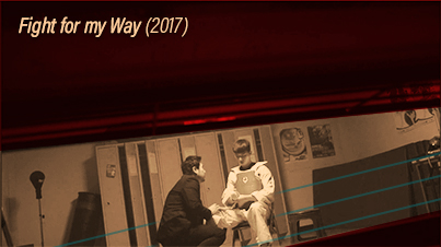 | |
The Dutch angle in combination with boxing can visually crush a character. | |
Fight for My Way | |
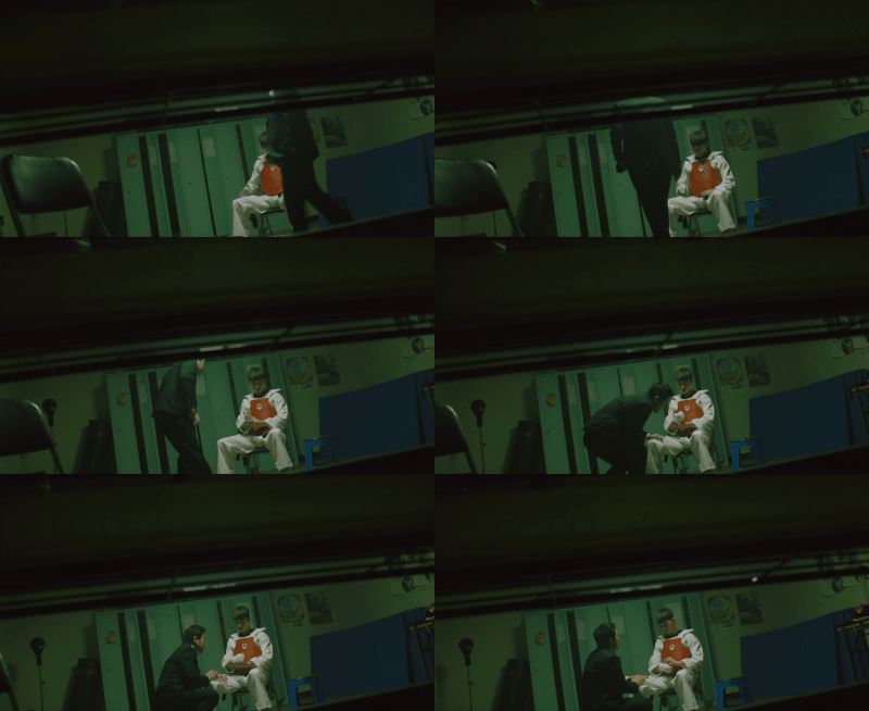
This example further illustrates how powerful the combination of these techniques can be. Here, Ko Dong Man (the ML) gets ready to fight against an opponent who's trying to win the fight before they step into the ring. As the other fighter's manager pitches his "offer" and tries to convince Dong Man to throw the fight... the director pans the camera sideways. Yet it is the obstruction recorded in the frame, which creates a box and externalizes the crushing pressure Dong Man is under. The Dutch angle adds to that by creating a visual tension between the characters. | |
DROWNING |
But by also boxing the character, we get the sense that she's trapped in her sorrow. |
While You Were Sleeping |
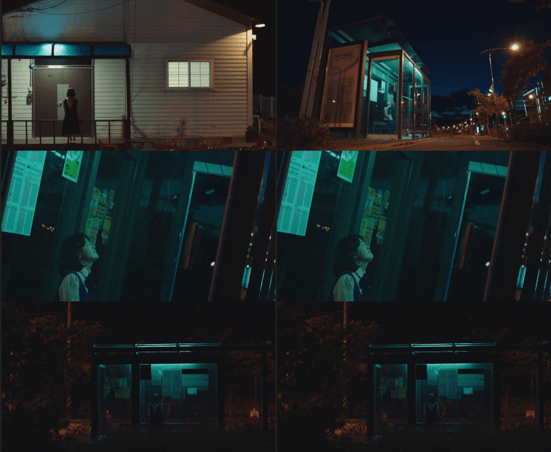
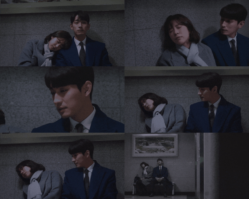
Like with the example above, While You Were Sleeping combines these techniques to create a heavy atmosphere full of tension. However, unlike with Dong Man, notice how much space Nam Hong Ju (the FL) occupies within the frame. She looks small, doesn't she?That's because the director is showing us how she feels. In that moment of pain and vulnerability, Nam Hong Ju feels isolated, alone and powerless. She's also cast in shadows, externalizing her profound sorrow. The box traps her and pushes her down, making it seem like she's drowning in darkness. And the dutch angle further reinforces her anxiety and the feeling that she's adrift and untethered. |
This set shows how, through the repetition of a technique, a messageCAN BE REINFORCED.(•‿•) (•‿•) |
At times, the director will reinforce a message or feeling by using a technique multiple times in either one scene or in subsequent scenes. Let's look at some examples:
REINFORCING | |
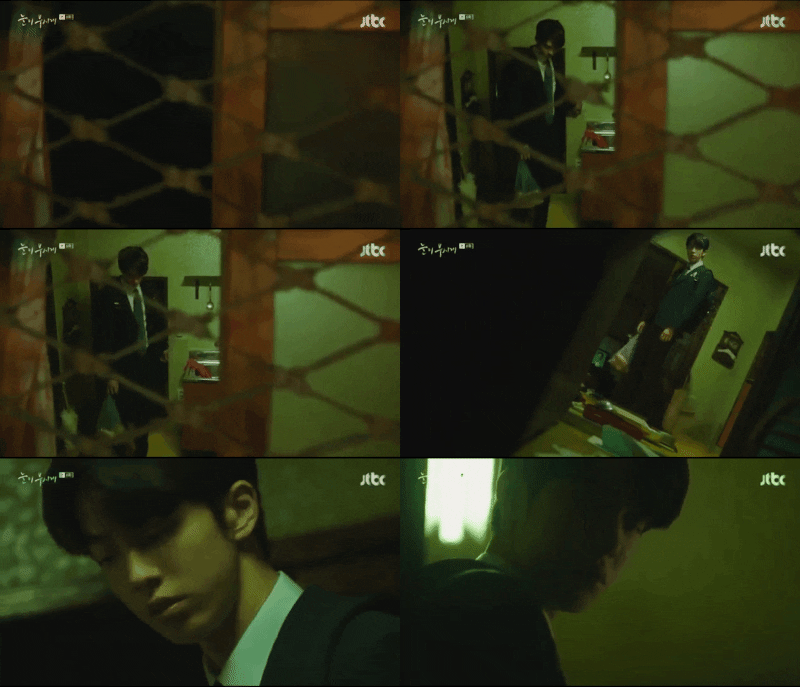 | |
By boxing the character several times in a short sequence, claustrophobia sets in. | |
The Light in Your Eyes (2019) | |
If you've watched this show, you know that this drama is quite heavy and the art direction matches that perfectly. Boxing and Dutch angles are prevalent, to the point where it's easier to count the number of shots where one of these cues wasn't integrated. Throughout the drama, the characters are boxed multiple times throughout a single episode, which contributes to the "hopelessness" that rests at the very heart of "The Light in Your Eyes".These examples are, therefore, only a small dose of how the repetition of a technique in short succession feels like. These shots aren't edited and the choppy feeling of jumping from one scene/frame to the next helps to perpetuate the sense of "disbalance". More so because a dutch angle gets inserted right in the middle, heightening the tension. On the left, Kim Hye Ja (the FL) gets boxed four times in a row, through several shots. The Dutch angle reinforces her anxiety after being given a harsh reality check not long before. The cold colors (blues) also helps establish a sense of dejection. On the right, Lee Joon Ha (the ML) gets boxed twice in quick succession as he returns to an empty home. The colors (toxic/lifeless green) and the addition of a dutch angle allows the director to drain all sense of hope from the scene. | |
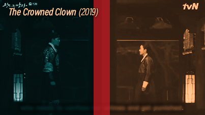 | |
By reinforcing a box the director makes it clear that these characters will never unite. | |
The Crowned Clown | |
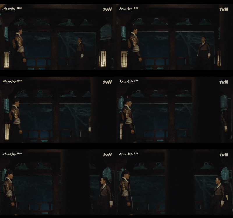
If you've watched this drama, you know these two are mortal enemies and have never seen eye to eye. During this scene, however, things are becoming dangerous for both of them. As Ha Sun (the ML) meets with the rebellious Queen Dowager in a neutral spot, the director reinforces their division (the line dividing the frame) by panning the camera behind an object. This makes it clear to us that, no matter what they say or how they negotiate, this meeting won't result in any form of alliance. | |
Romance is a Bonus Book |
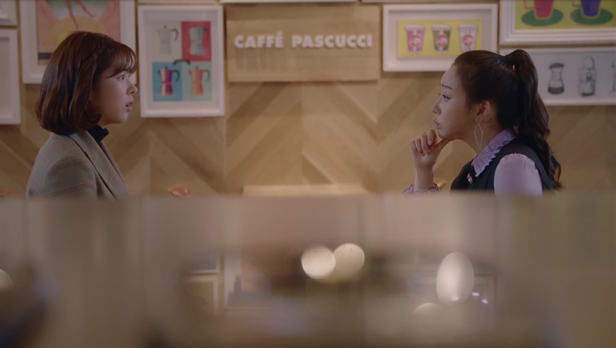
In this scene, we have Song Hae Rin (the 2FL) and Ji Seo Joon (the 2ML) meeting at a café for work-related reasons. At this point in time, they're each vying for the attention of one of the lead characters. Song Hae Rin is hoping Cha Eun Ho (the ML and her mentor) will figure out how she feels about him. While Ji Seo Joon is hoping to establish a romantic relationship with Kang Dan Yi (the FL and his neighbor). As the first snowfall hits them, they simultaneously reach for their cellphones. How could they not? There is a belief in South Korea that "if you are out in the first snowfall of the season with someone you like, true love will blossom between you." Though the director establishes, through separation and boxing, that the characters are thinking about someone else, the context (being together during the first snowfall) hints that these two might actually end up together. |
Romance is a Bonus Book |
Reinforcing the previous example, here we have two scenes where Ji Seo Joon (the 2ML) and Kang Dan Yi (the FL) are boxed separately despite being together. In fact, on both occasions, the characters were out on a date. However, if you've seen the show, you might've noticed how the director kept separating them within the frame. Showing us with whom his alliance laid in this love triangle/square. |
This set shows how, together, the techniques can showA SHIFT IN THE CHARACTERS RELATIONSHIPS.(╯°Д°)╯︵ /(.□ . \) |
Sometimes a director might use several cues at the same time to establish a shift in a relationship. Whether that will be to unite the characters or to separate them will depend on the concept and which cues are being used. Let's look at some examples:
AT ODDS |
While You Were Sleeping |
This one is an interesting shot. Not only because it marks a pivotal moment in the life of Jae Chan (the ML on the right), but also because of how much subtext it provides. If you've seen the show, you know that Lee Yu Beom (the antagonist on the left) has just crashed Jae Chan's motorcycle through a store window. As they freak out, Yu Beom instructs a younger Jae Chan to take the fall, even though he's blameless. When Jae Chan argues, Yu Beom gives him a harsh reality check. Paraphrasing his words, he says, "who will they believe? A troubled young man or a star colleague student?" This carefully constructed shot marks a parting point for them and their relationship. We get the Dutch angle externalizing their anxiety. Then the door frame acts like a big box trapping the two characters in. Yet a foreground object paints a dividing line within the box, separating them. And once your eye catches that line, you realize that Jae Chan is boxed tighter than Yu Beom, marking he has less power.The show proceeds to show us that lack of power by having Jae Chan take the fall. |
Hello Monster |
I love this shot. It's probably one of my favorites because it's charged with so much subtext. Let's deconstruct it to better appreciate it. If you've watched the show, you know this scene marks a pivotal point for Lee Hyun (the ML). As this little boy steps down the stairs into a hidden room, he's introduced to his gilded cage. The stairway doesn't just draw our eyes to his small figure, but it also act as a frame to cage him in tightly. Then the room opens up and we get another box, marked by the wooden pillars to either side of the desk. His father sits inside this other, wider, box. Notice how much breathing room he gets, unlike his son. This marks he holds more power since he's the one who's doing the caging.So with two techniques, boxing and dividing, we get an establishing shot of what Lee Hyun's life will be like now that his father has decided to treat him like a monster. |
SHIFTING | |
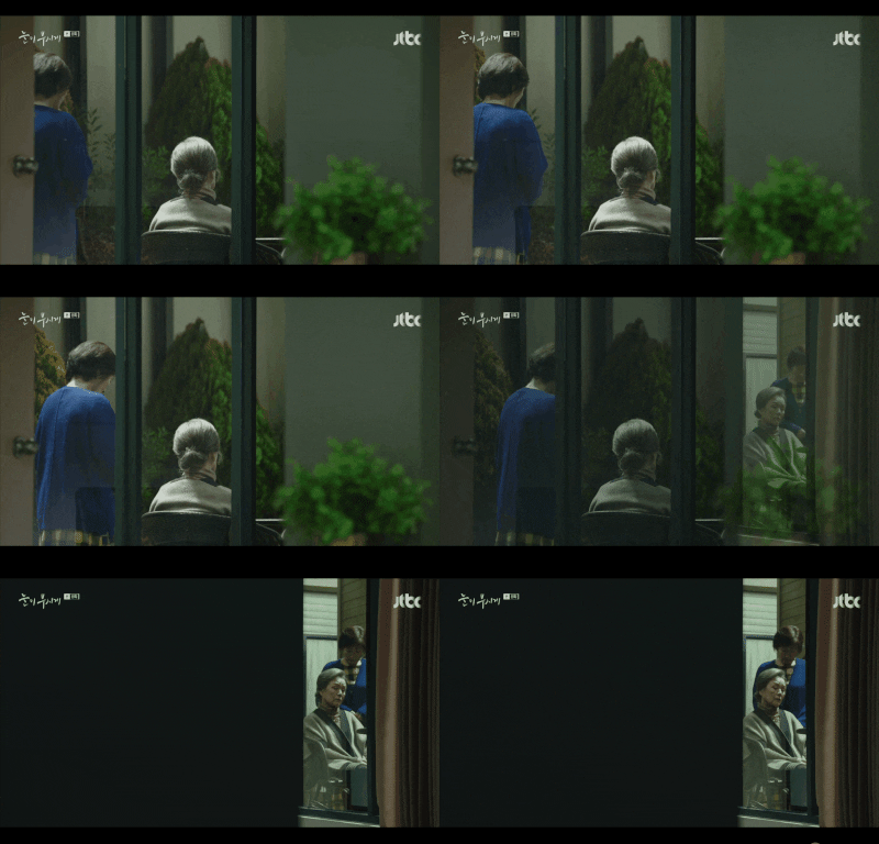 | |
Sometimes a similar visual treatment can mean very different things. | |
ITEM (2019) | The Light in Your Eyes |
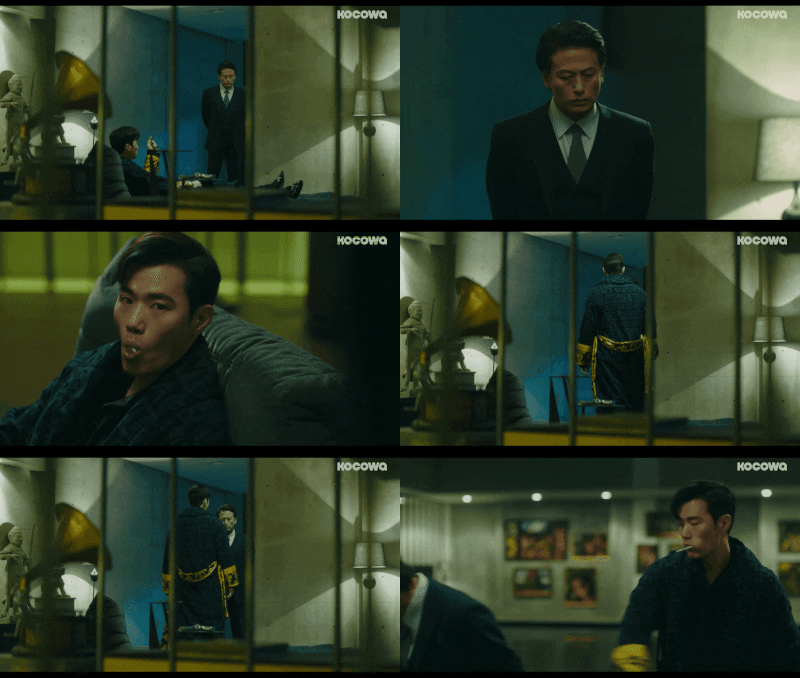
Though these two examples resemble each other visually, the context couldn't be more different.On the left, we have Jo Se Hwang (the antagonist) disciplining one of his men. The shot starts by separating them into a different box. As the conversation progresses, Jo Se Hwang (who holds more power) crosses over into his minion's box. However, rather than unity, he shows hostility. Notice how he overtakes that box as well, leaving the other man with very little space. Though I had to cut the shot short, it was interesting that as he hits the man, the minion staggers into a different box, telling us they are still divided. Meanwhile, on the right, we get Mrs. Chanel (support character, sitting down) having a really hard time after finding out something regarding her son. Kim Hye Ja (the FL) comes in slowly, wishing to comfort her friend. So she crosses over into Mrs. Chanel box. And as the camera switches angles, we're given a view of a more dramatic box. Now the two women in their little box become the only source of light in an otherwise empty, dark frame. That tells us that, at that moment, only they (and their friendship) exists. | |
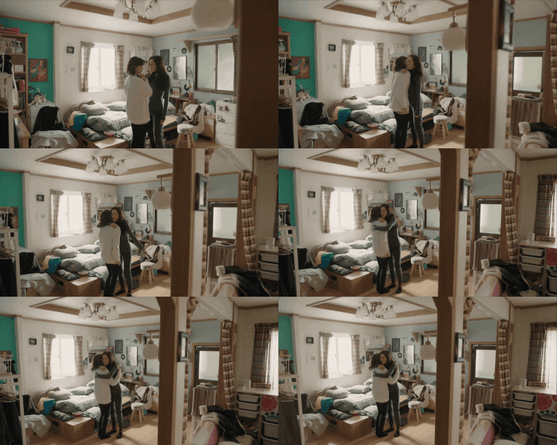 | |
A director may end a scene with a shift to give it power. | |
Spring Turns to Spring (2019) | |
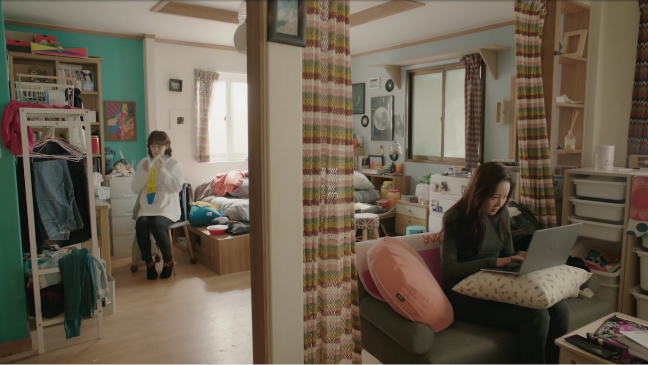
I like this shot because the director makes a full circle.At the start of the scene, these two women are each confined to a different part of the apartment. Which is to say, they were divided. However, as the scene unfolds and they reach an agreement, one of them (Kim Bo Mi in Lee Bom's body) crosses over to the other side. And as they hug, the director backs the camera away, showing us the dividing line he used before and, in so doing, he boxes them together. BTW, if you're looking for something really lighthearted to watch, then this is a hidden gem! | |
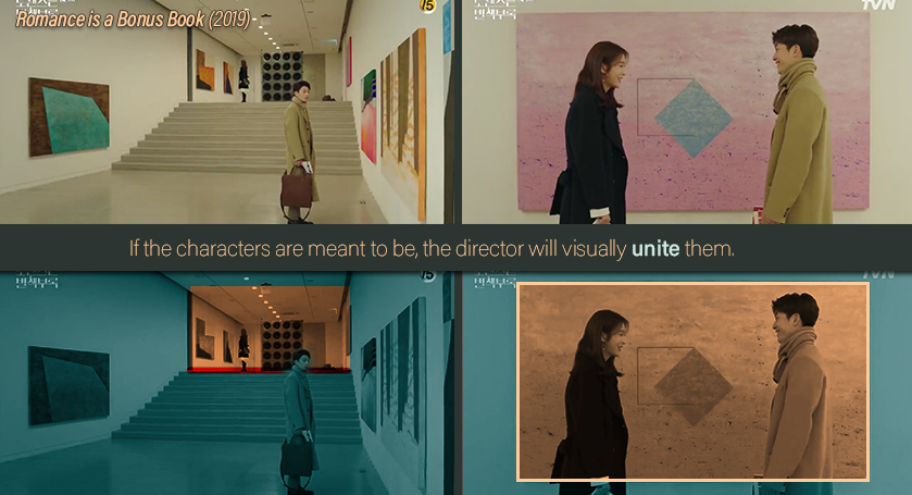 |
Romance is a Bonus Book |
Remember the previous example of these two sitting at the cafe? Though the director separates them at the start, he uses one of the paintings to unite them by the end of the scene. This lets us know that, as we've predicted, his end game will be to have these two become a couple. |
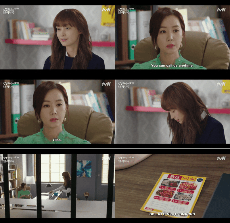 | |
Sometimes a director may show characters are getting closer, even if they aren't yet united. | |
Romance is a Bonus Book | |
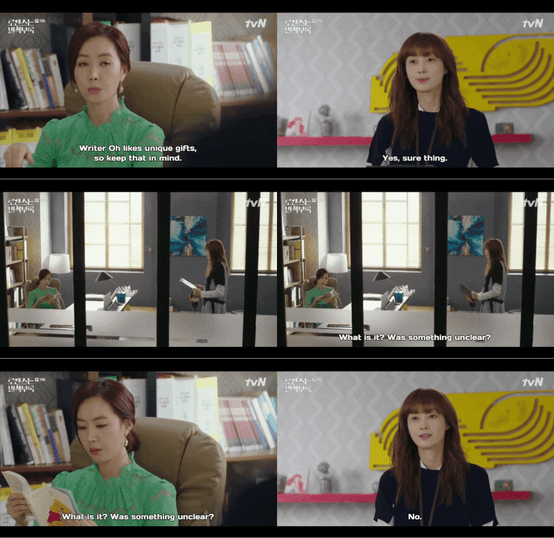
If you watched this show, you know these two have an almost on-and-off sort of friendship, mostly due to Ko Yoo Sun's (the woman in green) cold and unapproachable personality. So, of course, it falls on Kang Dan Yi (the FL) to try and close the gap. However, a friendship will only work if they're both willing to step forward. So I found it interesting (and poetic) how the scene establishes three boxes. Each character is inside one, with a third, empty box in between them. As the conversation unravels, Dan Yi steps into the empty box with a reminder that she wants to be friends. The scene ends there, telling the audience that the decision of whether to unite or not, is in Ko Yoo Sun's court. | |
PARTING POINT |
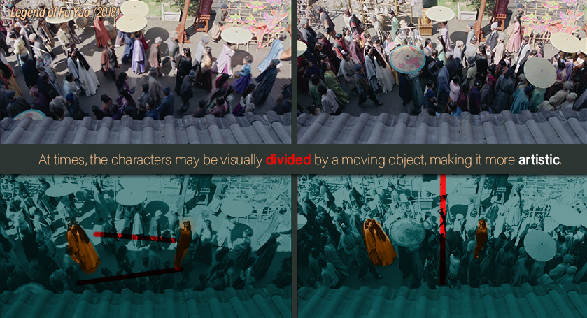 |
Legend of Fu Yao |
The C-drama Legend of Fu Yao shows us an interesting approach at grouping and then separating characters to add a strong visual subtext to the narrative. In this case, these two brothers are trapped in a difficult love triangle which involves the daughter of their worst enemy. As the two brothers seize each other up, the crowd rushes forward, creating a barricade between them, effectively separating them.With this decision, it becomes clear that the girl's heart is and might always be with the older brother. |
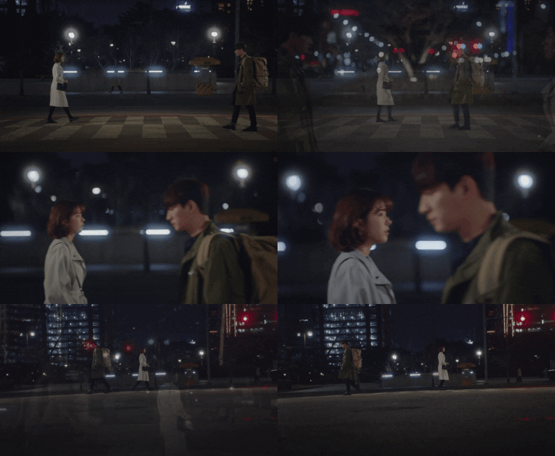 | |
It's common for the director to establish a parting point which is then reinforced shortly afterwards. | |
Legal High (2019) | |
Like with the previous example, here we get a parting point on the love story between the Seo Jae In (the female lead) and Kang Ki Suk (the second male lead). Up until this point, these two had some "romantic" moments together. And, in fact, at one point they both showed romantic interest in the other, perhaps he much more than her. Wherein one of the protagonists unconsciously rejects or draws away from the other character. This shows us the director doesn't intend to have them together.So, later on, he will reinforce the message as he did with the scene on the right. Where the characters crossing the street are so engrossed in their thoughts (in this case, they are both thinking of the male lead) that they fail to see each other. You could even argue that this scene shows a "shift" in their thoughts, as they're both thinking about someone else. So keep an eye out for these types of scenes, especially when it involves a love triangle. | |
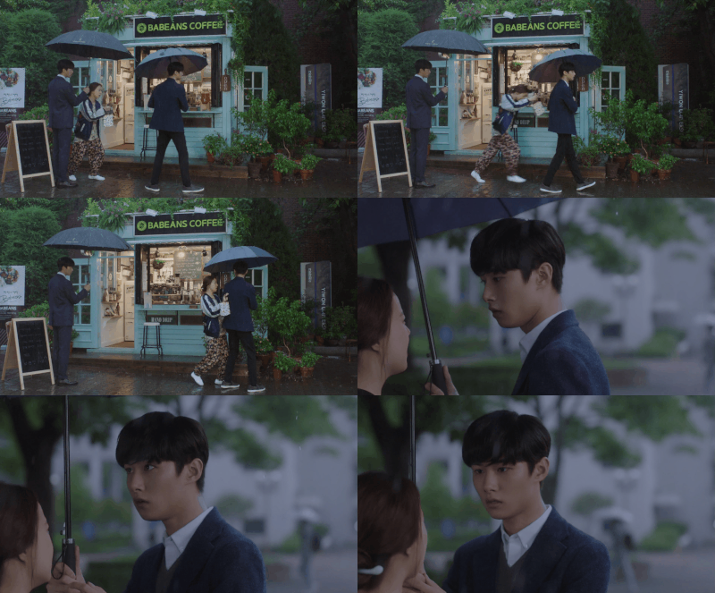 | |
A parting point might simultaneously become a new path for another character. | |
Mama Fairy & the Woodcutter (2018) | |
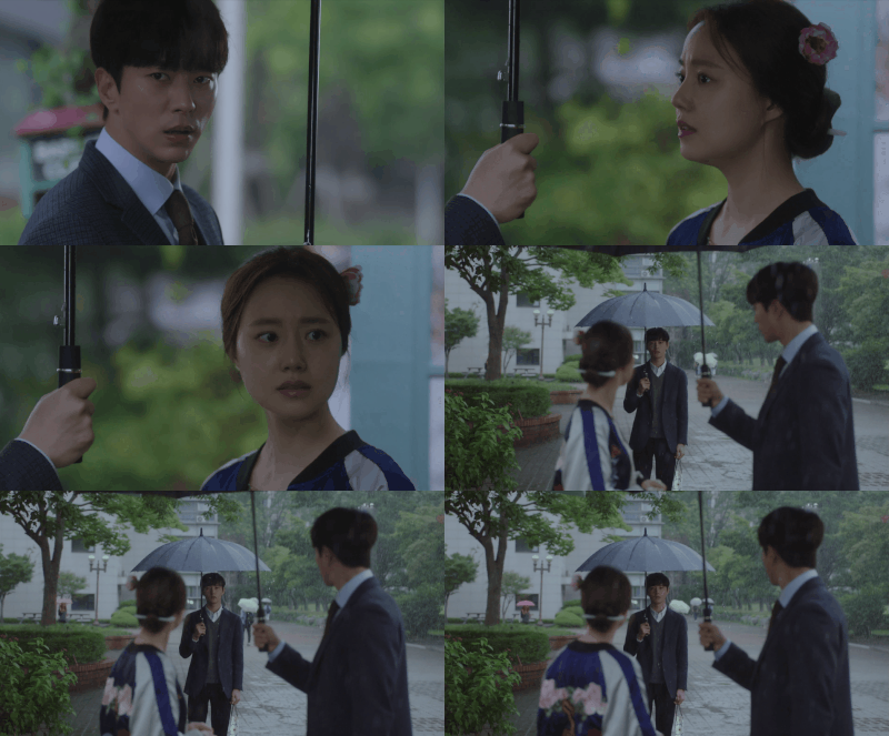
I was hesitant to include this example given it could be considered a BIG spoiler. For that reason, I decided to at least spoiler tag the title of the drama. I ended up including this because it's a great example of a character who'd been stuck in an extensive love triangle, literally "jumping ship" and, in so doing, making a clear choice (well, clear to us even if it's unclear to the character). To say this is a pivotal moment would be an understatement. Up to this point, it was unclear whom she would end up with. However, this particular scene finally put the question to rest, as the female lead shifts from one man to the other. The way the scene was set up is not only very poetic but also extremely effective. Just think of the umbrellas as "boxes", which unite characters. The space between those umbrellas becomes the dividing line. | |
¯\_(ツ)_/¯ |
This set shows that there's alwaysEXCEPTIONS TO THE RULES. |
Sometimes, a director just wants to have fun. ♪ヽ(´▽`)ノ
Cool Factor | |
 | |
Legal High (2019) | |
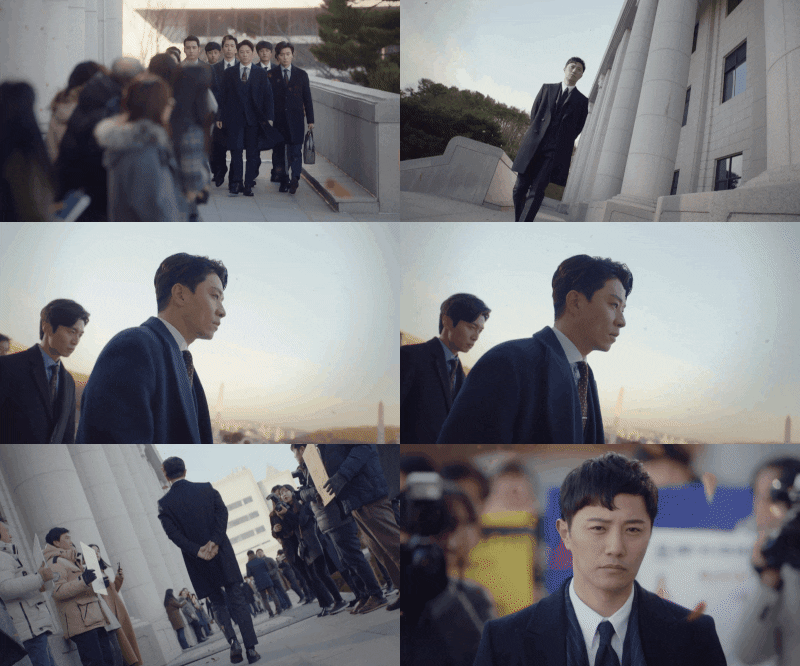
This peculiar and entertaining drama doesn't take itself too seriously. And that becomes apparent in the way the director incorporated some of the visual cues. The recurrent use of the Dutch angles in these examples is overdone and overuse in a sarcastic, comical and almost childish way to GREAT effect. The result: coolness for the sake of coolness. A confrontation that's so over-the-top it's hard to take seriously!But it works because that's precisely how the director wants us to feel. BTW, if you're looking for a feel-good show that doesn't ask too much from its audience, I highly recommend this one! | |
Context | |
 | |
Fight for my Way | Legal High (2019) |
Although these two shows look surprisingly similar in their composition, their context is quite the opposite.On the left, we get two women about to have a hostile confrontation. The contrasting colors help create a "harsher" (or more hostile) box. On the right, on the other hand, we get two friends having an insightful conversation. The boxing is done subtly, with the colors matching and merging. This helps create a sense of closeness rather than hostility. | |
And with this article, this series has come to an end. But, of course, this isn't the last you'll read from me. Apart from the motifs series, I am planning other articles as well. I've been working for a few weeks with @Lua on an article involving tropes in romance K-dramas and what insights their usage yields. Hopefully, we'll finish analyzing all the information we've collected and can start working on the actual article. Although we still need to pitch it to the editors and see if they'll allow it. ;)
Did you enjoy the article series?
If you did let me know in the comments down below, I'd love to hear your thoughts!
Some questions to get a conversation started:
- Do you have a favorite technique? If so, which one is it?
- Was there an example which you found more insightful? If so, which one was it?
- Where my explanations clear?
- Did you like the inclusion of more gifs as opposed to stills? Or are you indifferent so long as the point is clear?
- Have you watched some of the dramas I've used as examples? If so, do you agree with my interpretations?
- Are you looking forward to the rest of the articles? Is there one in particular that appeals to you? Why or why not?
- Would you be interested in reading an article involving the ways directors show who the characters will end up within romance K-dramas? I've already shown a couple here, but there are others that can be covered.
- Did you like the length of this article? Or would you prefer it even shorter?
